Inspiration and creation of styleguides
My first step for this phase was to collect and review the various style guides, Google docs, the contents of Dropbox folders, Confluence pages and Sketch files.
To determine how best to approach these issues, I ran brainstorms with the design team to define the technologies and tools we could use to improve our workflow, grid and breakpoint usage and developer handover process.
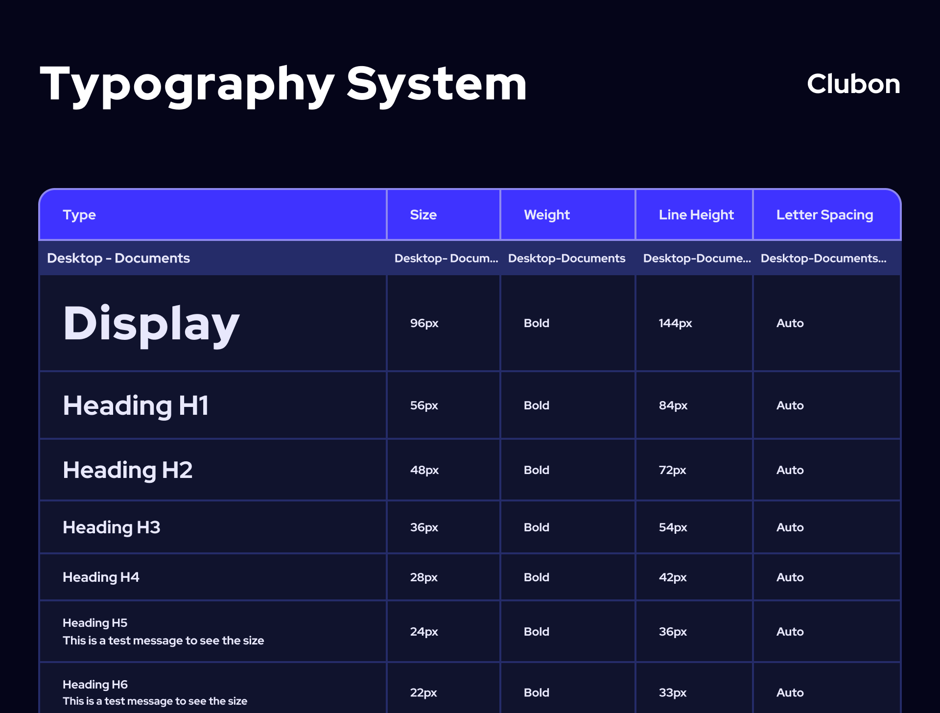
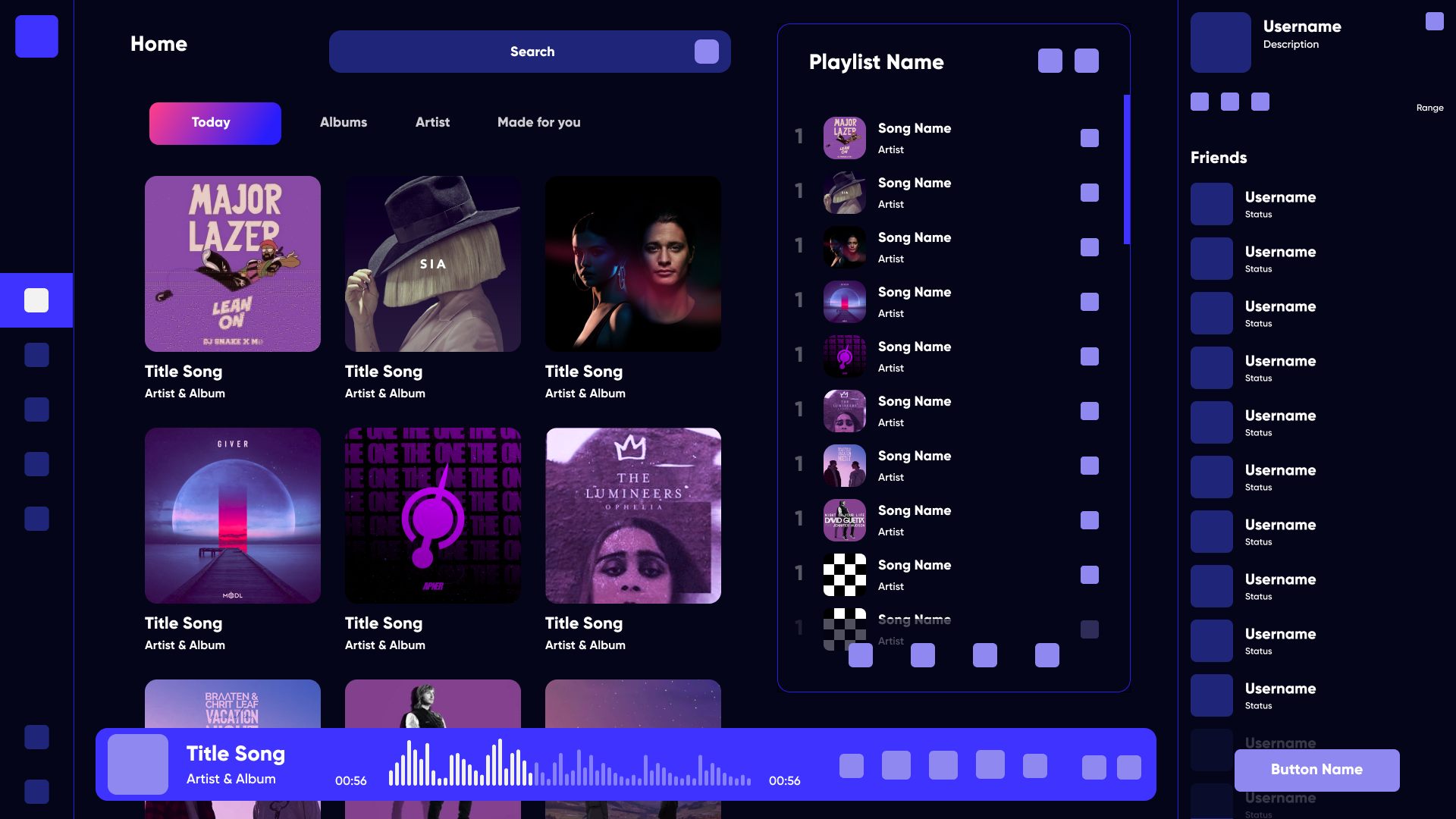
We chose to adopt the 8pt grid system with 16 columns on XL/L breakpoints and 8 as the browser sizes down. This allowed us to create more interesting layouts whilst introducing consistency and rhythm across products, and avoiding the rendering issues associated with scaling half pixels.
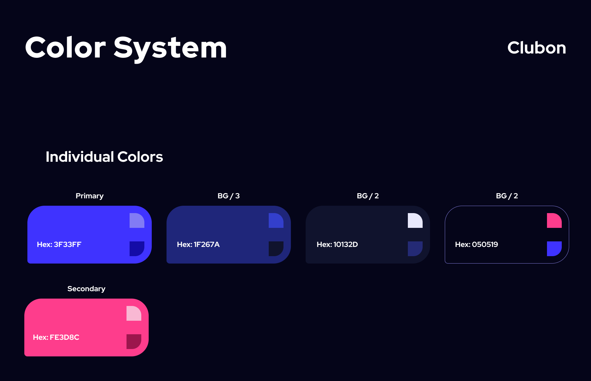
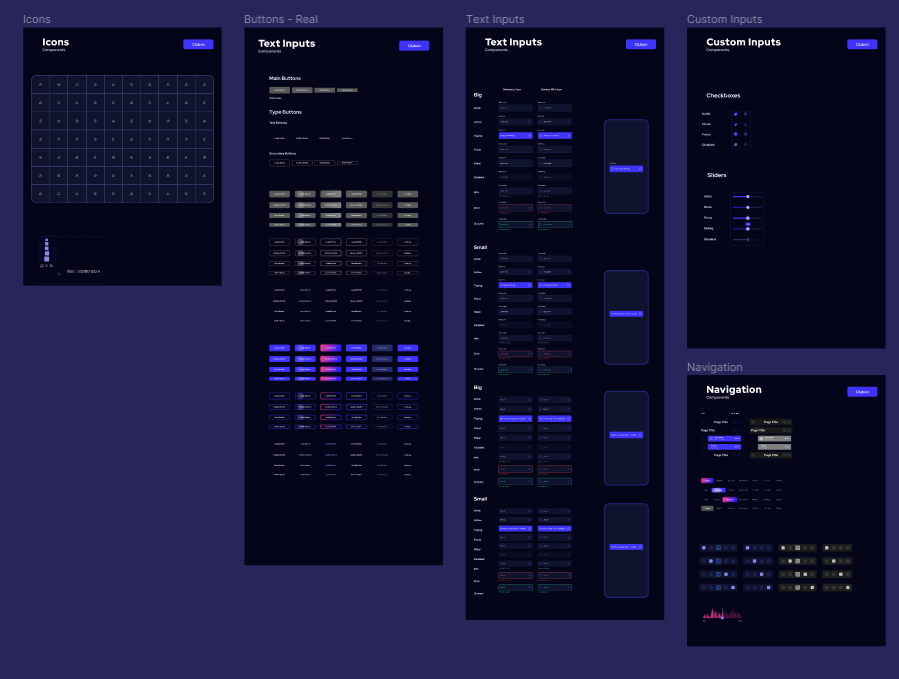
After experimenting with alternate options, we chose to continue using Sketch for the UI kit. We didn’t want to change tools just for the sake of it, and the only major issues we had identified (duplication of symbols, file versioning) we could resolve by adding Abstract and shared component libraries into our workflow. The resulting library is fully themeable for new client projects, and makes use of shared colour, layer and typography styles for quick and easy customisation in a similar way to how these would be updated in CSS.
Prototyping the experience
With low-fidelity prototypes, the planned syllabus and the general structure of the application could easily be tested in usability tests. Without much effort, adjustments could be made before going into the much more costly digital implementation.
After some paper prototyping adjustments, wireframes, mid- and high-fidelity prototypes were created, which I supplemented with clickability using ProtoPie. Again, user tests revealed small vulnerabilities in the structure of the user interface, in some formulations and interactions. In addition, the users asked smart questions, which led to further improvements.
Final Results
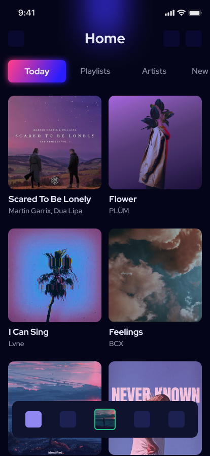
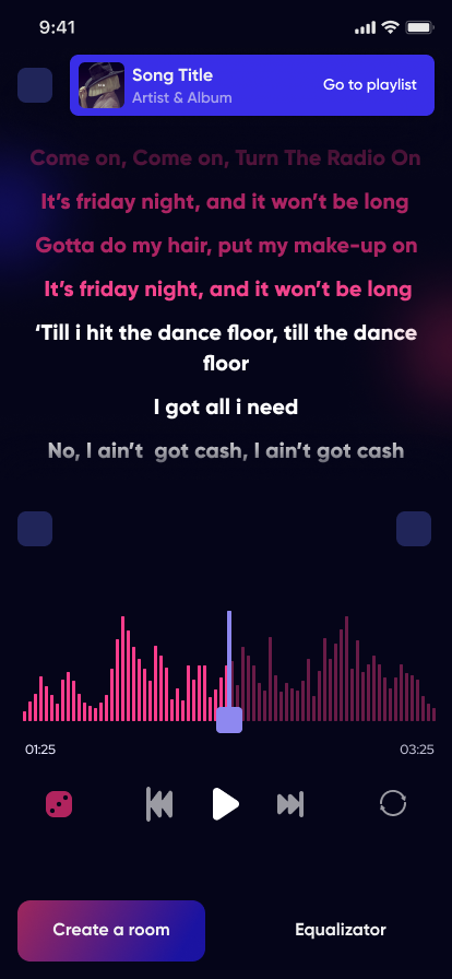
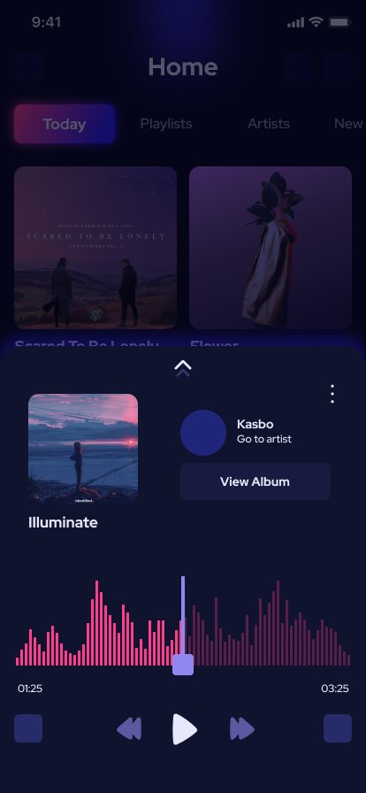
Once the main functions of the application had been tested and iterated, all aspects of the styleguides and the inspiration collected were implemented in the UI. Thus, leaving a beautiful interface that is easy to use.