Understanding the problem & Validating Ideas
I conducted research interviews with our primary users (Traders) to uncover any pain points that they were experiencing.
My research focused on:
- Understanding the user goals and needs.
- Uncovering pain points with the existing user journey.
- Determining the success of the tasks measured.
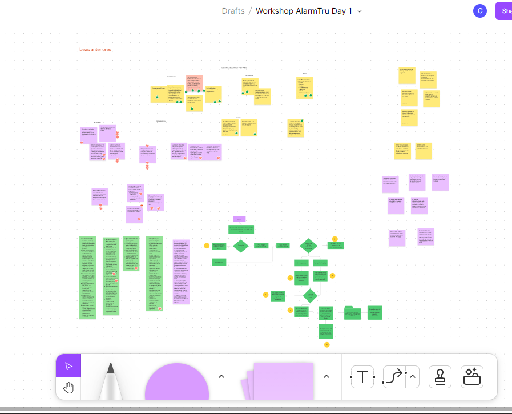
After this we grouped the recordings from the user interviews under common themes and features in the platform.
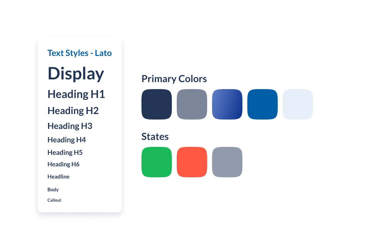
Styleguide
For the color palette, I choose blue as the main color and in companion with a lot of white space to give breath between elements – the blue represents security, orderly, and inner peace. The user target is middle age, so it needs to be reliable, and for that, I choose the typography.
Also, the whole app has a diversity of colors for details that give it a fresh experience to users.
Wireframing and prototyping the solutions
I quickly mocked up some basic wireframes to gather feedback from Product, Engineering and the users on the overall layout and structure of the wizard form. This involved establishing a standardised visual hierarchy and layout for the future wizard component.
The lack of a formal wizard component also meant that I had to come up with a standardised styling and UI pattern for future wizards
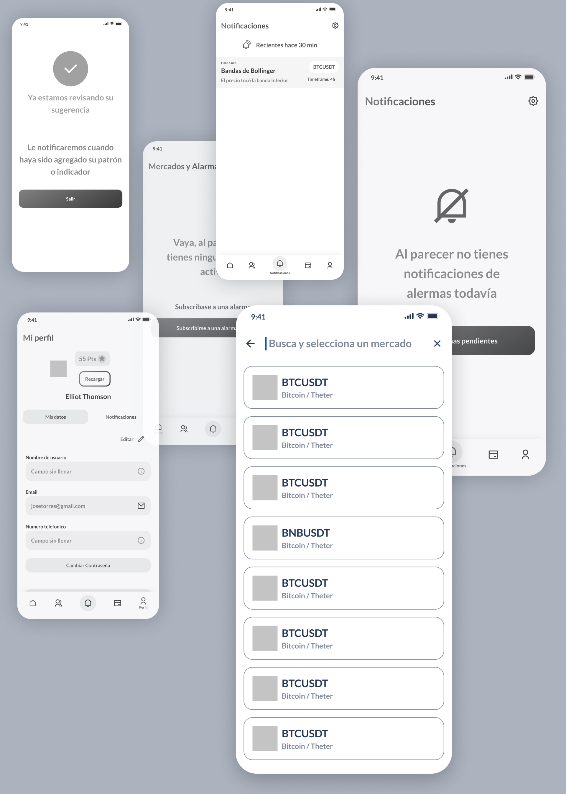
Several iterations later, the fidelity of the prototype was increased in order to carry out the tests with real users.
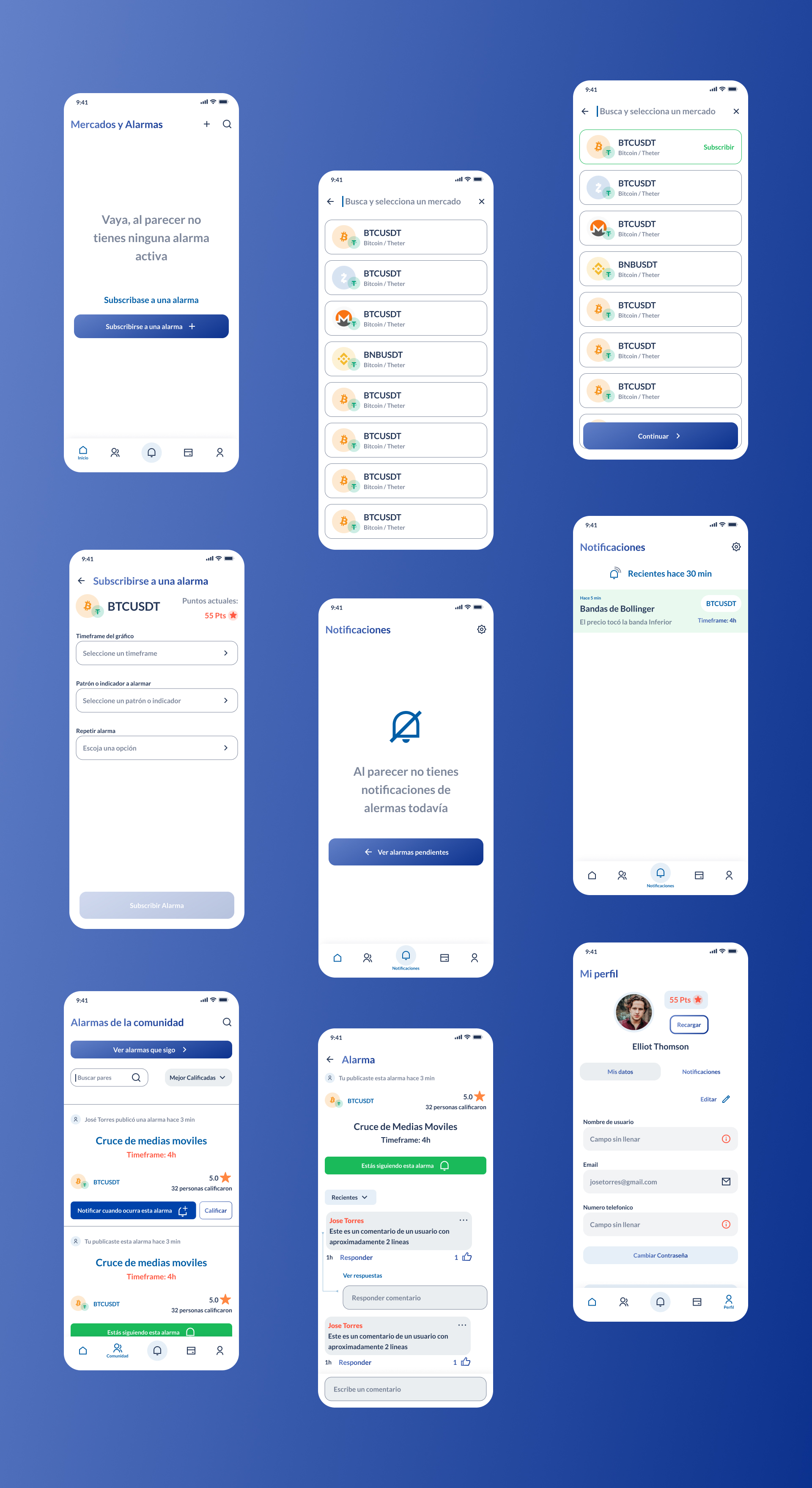
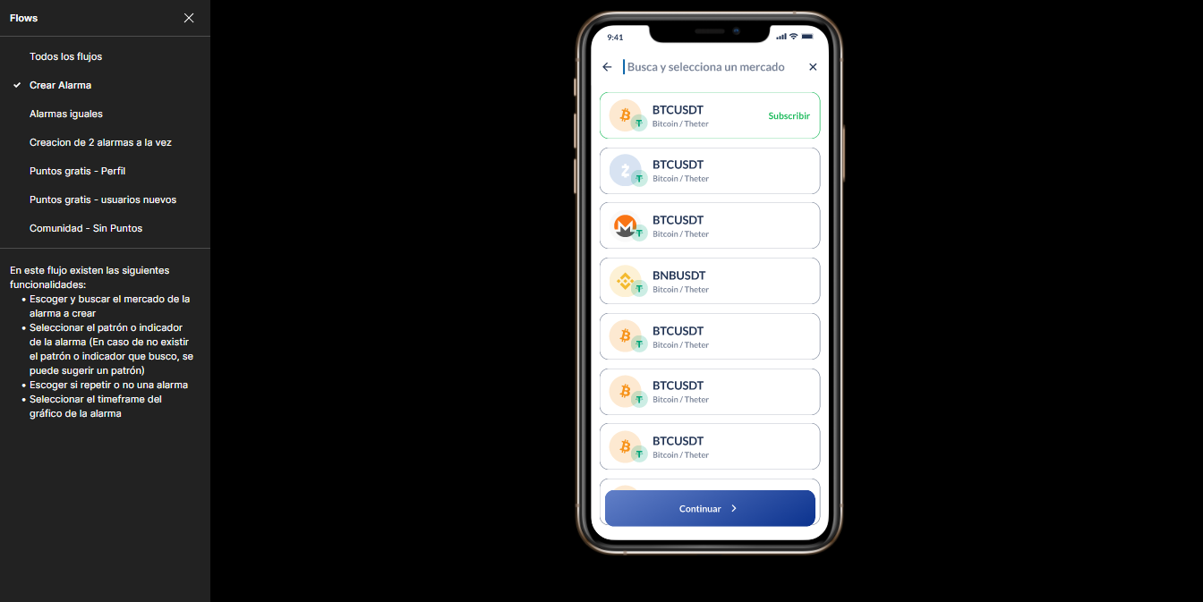
I conducted usability testing sessions with our primary users to validate whether the new designs would solve their problems. I wrote a script including a scenario asking the user to create a new trading alert with a pattern that he wants to be alerted.
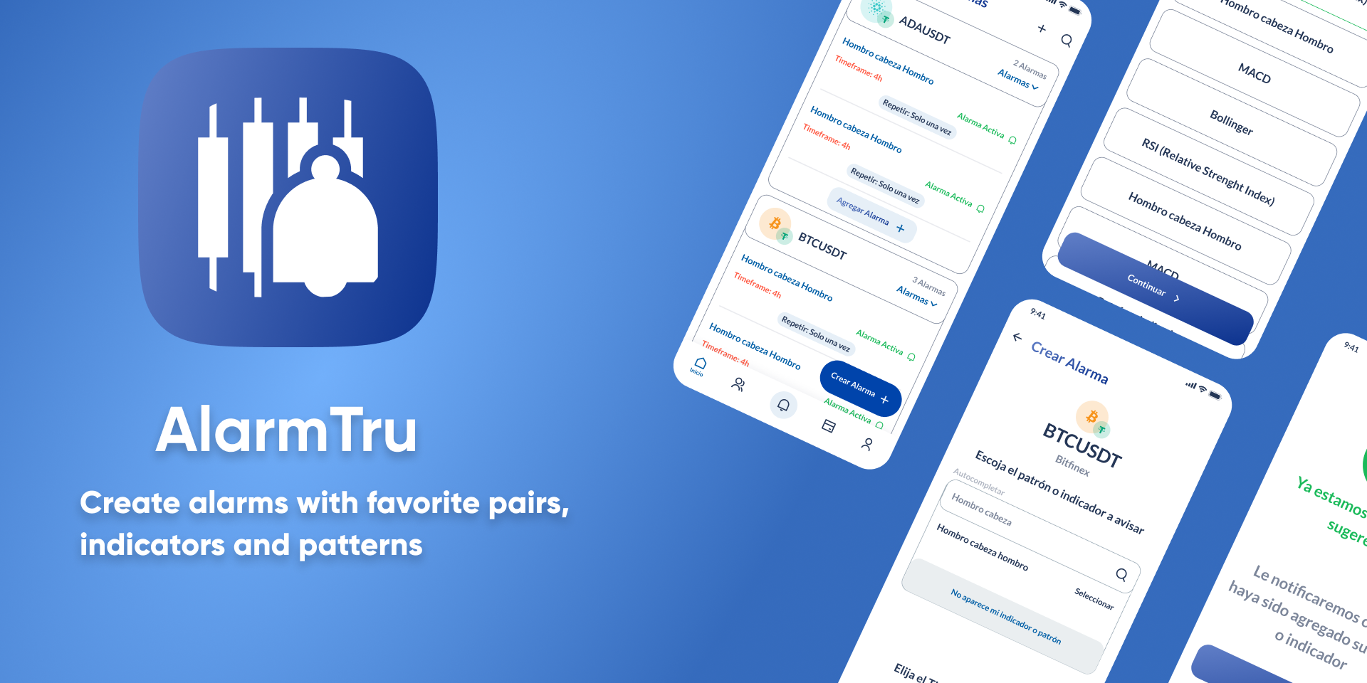
Final Results
I have received positive feedback from users about the simplified configuration of their alerts, saving them a large proportion of their time, but user testings doesn't end there, we needed constant iteration before the development process.
(currently this app has already been developed and is still in constant interaction with user testings.).